Weekend Painting: Chevron Rug

As if painting a magnet board and making a piece of art wasn’t enough, I decided this was the perfect weekend to start mission rug redo.  I bought a jute rug from a local thrift store recently and decided this would be the perfect chance to paint a rug.  Martha Stewart did a segment on painting stripes on a sisal rug, so I used that as a starting point.

First, I created a template to use as a guide for my design.  Starting in the dead center of the rug, I used painters tape to mask off a chevron design, placing my template down and taping around it.  I also made a second template to use as a spacing guide.  After I had my design completely taped off, I used the handle end of a screwdriver to rub the edge of the tape down.

I sent Ben off to the hardware store to get a quart of white oil based paint.  He came back with this:

I started by ‘pouncing’ along the taped lines, just like stencling, to prevent the paint from seeping under the tape.  Then Ev started crying, so I took a break to feed him.  I let my first area of paint dry and peeled back part of the tape to check my lines.

Happily, the paint didn’t bleed under!  So, I painted, and painted, and painted.

Then, I ran out of paint, so I bought a gallon.  I returned home, full gallon in hand and painted some more.  This was by no means a speedy process.  It took about 4 hours to get everything painted.  I let everything dry for 24 hours before removing the tape.  Definitely do this outside, as the dry paint flakes off the tape, making one big mess.

I like the bold pattern.  I think it’s just what this room needed.

In all honesty, I love the look of the painted rug, but not the feel. The paint does dry crunchy, BUT, a jute rug is never squishy and cushy, so it’s not that different than the unpainted rug.  This would be much better in an outdoor setting, like a doormat or ourdoor living area.  Until I can find a plush rug I can afford, this will stay in the boys’ room.  I do think it will make an appearance outside at a later date.

Choosing Paint Colors

Paint colors can be difficult to choose.  A lot of colors look great as paint chips, but not as great in mass quantity on a wall.  We have definitely had our share of colors that seem great, but are atrocious.  We have learned a few tips and tricks (some the hard way) about painting. 

A few months before Ben and I were married, I came out to Montana to visit.  During that visit, we started brainstorming ideas for the first few rooms we planned to finish.  We easily agreed to install white trim in every room.  Then, we chose paint colors, bought a few gallons and went back home.  We chose Ralph Lauren’s Riesling and Behr’s Squirrel.  I liked the airiness of Riesling and the moodiness of Squirrel.  Ben lovingly agreed.  We painted the first finished bedroom Riesling and loved it. 

Then we finished the guest room.  Then we repainted the living room.  When we finally got around to the master bedroom, the tone of the house had been set.  Dark, moody Squirrel was out.  It just didn’t fit.  I loved the color, but it didn’t work with the rest of the house.  We tried a lighter grey, but decided we needed a color that coördinated with the finished rooms. 

Moral of the Story: When choosing paint colors, first think about if the color will coördinate with other colors in your house. 

I am more drawn to colors on the cooler side of the color wheel, like greens, blues, and purples.  Red, orange, and yellow are on the warm side of the color wheel.  In my opinion, pale blues and pinks are by far the least forgiving.

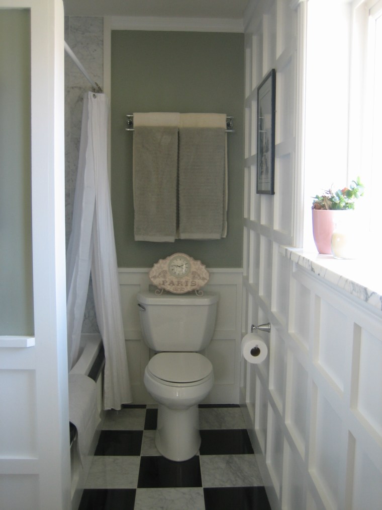
Our master bedroom color scheme is green with pink accents.  When we finished our master bathroom, which is attached to our bedroom, I wanted to switch things up, but not too much.  Rather than green walls with pink accents, I wanted pink walls with green accents.  Well, I chose a light pink, got home and started painting.  Oops!  Definitely not a light pink.  More like bubblegum pink!  Needless to say, our bathroom did not stay pink.  Nope, it’s the same color as our bedroom. 

Moral of the Story: If you’re looking for a pale color, choose one that you like, then buy the lighter version.  Believe me, paint seems to get brighter when you start putting it on your walls.

By far, my favorite paint colors are from Restoration Hardware.  Saturated hues toned down with grey equals perfection in my book.  Thus, many of the colors in our house are Restoration Hardware colors, color matched at Wal-Mart.  Our main bathroom is RH Lilac:

The guest bedroom is painted RH Sea Green:

Our master bedroom and bathroom is RH Bay Laurel:

Our basement and dining room are mis-tinted versions of RH Silver Sage.

The basement bathroom is RH Sycamore Green:

Moral of the Story:  When you find something that works, stick with it.  I love that most of our colors are from the same line of paint, so everything is cohesive and goes well together.

We use satin finish paint in almost all our rooms, with the exception of the bathrooms, where we used semi gloss.  We chose these finishes for durability purposes.  Flat finishes do not stand up to the damage our two-year old doles out on a daily basis.

Dining Room: Updated

Over the weekend, we decided to repaint our dining room, completing the transformation.  We used the same color as the basement, which extends up the staircase and is visible from the living room, dining room, and kitchen. 

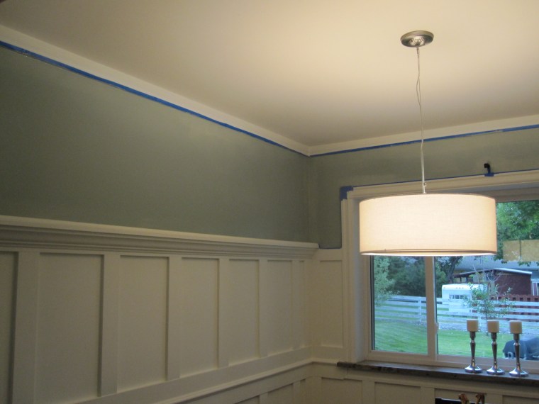
I cleared the room and taped off the trim while Ben was at work.  After removing the curtains, I decided that I liked how open the window looked.  So, I took the outer curtain supports down, patched the holes and sanded it smooth. 

I don’t have much time to paint with a three-year old and four-month old.  Fortunately, Ben is a quick painter and the area is small.  It literally took about eighteen minutes to repaint.  Here he is, hard at work.

We had to do two coats.  One on Saturday afternoon.

And another on Sunday morning.

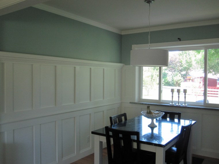
Ben hung the curtain brackets about 5 inches from where they were.  It’s really amazing how much more open the window seems now.  I love it.

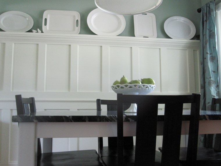
I did love the old, dark blue color (Benjamin Moore’s Hale Navy), but this definitely fits in with the rest of the house.  The curtains are more fitting with the wall color, too.  Sure, the plates don’t pop as much against the new wall color, but the dark table top was just too dark with the old wall color. 

The room has come a long way in the past few years.  Now it’s exactly as I had imagined.  The plate rack is a nice feature, serving as art and storage. 

We have some touch up paint to do, especially on the white, but it’s good enough for now.  I’m a happy camper.  Touch up paint can wait.  Let’s take a trip down memory lane, shall we? 

Here was the dining room as I received it, thanks to Ben’s decorating.

Then we added trim, a plate rack and repainted.  We also bought a new rug and I made curtains.  Then we had this:

We recently installed a new light fixture and Ben built an ah.maz.ing table for us, bringing us to this point:

And here we are today!

Do you have any projects to take on this weekend?