Bubbling Up

Here’s another quickie project to help you get organized.  Or at least more organized, can’t fix every problem with a few hooks now can ya?  It started when I saw these cute metal cloud hooks.

Then I looked at the pile of Everett’s costumes and set out to make cute hooks.  A stop to Michael’s and Home Depot gave me everything I needed:

1 inch wood dowel

Pre-cut wooden shapes (I chose conversation bubbles, but there are so many fun shapes, including clouds)

Dowel screws

Sharpie paint pen

Convo-Bubble-Hooks-Sipplies

Not pictured, you’ll need craft paint, clear coat, wood glue (or your favorite strong glue), a drill, saw, and pliers.  Cut the dowel to length, mine are 2 inches and sand any rough ends.  Then glue the wooden shapes the front, pressing firmly.  Once dry, paint all sides of the hooks.  Drill a pilot hole the size of your screw shaft in the end of the dowel.  Screw the in, making it tight.

Convo-Bubble-Hooks-Assembled

I chose to write on the bubbles, to look like a comic books.  Gotta love a little onomatopoeia, right?  Seemed fitting since the hooks hold super hero costumes.  So I wrote words like Boom, Kapow, Zap, and Thud with the Sharpie pen and gave the hooks two coats of clear finish.  I screwed them to the wall (find a stud or use anchors, just to be safe) and showed Everett.

Convo-Bubble-Hooks-Hung

He thought they were “so nice.”  Mission accomplished.

Convo-Bubble-Hooks-Side

I’ve got two more that I might add, but we’ll see.

Convo-Bubble-Hooks-Behind-Door

Something similar could be fun and functional in an entry, too.  Maybe with names on them?  Maybe not, to look like little floating art…

I’m Bringing Drexel Back

Admittedly not as catchy as bringing sexy back.  On Thursday, the boys and I ran errands, then took advantage of the sunny weather by stopping in a garage sale and two thrift stores.  We left Goodwill with three small planters for $1.50 each.

Thrift-Store-Planters

But we hit the jackpot at our second store, striking gold with this beat up Drexel dresser.

Listed at 90 dollars, I wasn’t going to buy it.  I asked if I could get a discount for the scuffs and burns on it.  The manager took off 25% making it $67.  Not needing another dresser, I couldn’t decide.  Yes, it would look great in the boys’ room.  But they had a white one that worked just fine.  So I asked you, and nearly everyone said, “YES!”  Tipping point, I bought it.  Over the weekend, I sanded it down, getting down to bare wood.

Originally I thought I’d stain it dark (to match their bookshelf), but seeing the pretty grain made me question that decision.  Again, I asked you what to do.  This time, votes were about 75/25, so I went with a clear finish and gold painted hardware.

Drexel-Handle-Parts

Now, Drexel’s back and more handsome than ever.

Drexel-Dresser-front

He’s a far cry from the antique-y white dresser of yore, adding a warm wood tone and sleek lines.

Boys'-Bedroom-One-Year-Later

Drexel-Dresser-with-Beds

Look at those legs!  Slightly tapered, no cankles.

Drexel-Dresser-Handle-Stack

Drexel-Dresser-Side

Perhaps the handles are the furniture equivalent of a gold chain?

Drexel-Dresser-Handle-Detail

A few burns and one stain are still slightly visible on the top because they went too deep to sand out.

Drexel-Dresser-Top

Sixty seven dollars well spent.  Because we already had sand paper, spray paint, and clear coat, $67 is all I spent on this guy.

Drexel-Dresser-in-Boys-Room

Another change in the boys’ room that has me chomping at the bit to give this room some attention.  Like paint covering the walls.  All four.  And a twin bed for Ev, once he’s unhappy sleeping in his crib.

Stellar Embroiderery

Constellations.  They’re just so…cool.  In elementary school, we had a special week with the Star Lab, a big, inflatable dome with a star projector.  It was awesome.  And who doesn’t like star-gazing?  That’s what I thought.  So, I made two stellar embroidered art pieces for the boys’ bedroom.  I started by drawing a constellation map on navy fabric I bought for the guest room headboard (but didn’t use).

Embroidered-Constellation-Template

Using white embroidery floss, I made stars and connected the constellations together.  A large embroidery hoop kept my fabric tight while I worked in sections.

Embroidered-Constallations

Not sure why, but I thought this would be a relatively quick project.  I was wrong.  It took several hours to make each 16 by 20 piece.  But, it was worth it.  After stitching every star,  I stretched centered the fabric over an old canvas, then stapled it to the back, pulling tightly as I worked around.

Embroidered-Constellation-Detail

A few areas didn’t stay tight, but that’s okay.

Embroidered-Constellation-Loose-Detail

Now the boys can learn the constellations of the northern and southern hemispheres.

Embroidered-Constellation-Art

Like upside down Orion at the top, holding his bow.

Northern-Hemisphere-Constellation

And look!  There’s his lower half in the upper left corner.

Southern-Hemisphere-Constellation

Getting one small thing done always makes me want to start/finish/fix other things in a room.  Like painting the walls a solid color (popcorn, I’ll get to you one of these days!) and maybe spruce up this little hand me down play kitchen.

Embroidered-Constellations-with-Kitchen

Do you think these are stellar?  (Pun intended).  Have you recovered or repurposed old canvases?

Open Season

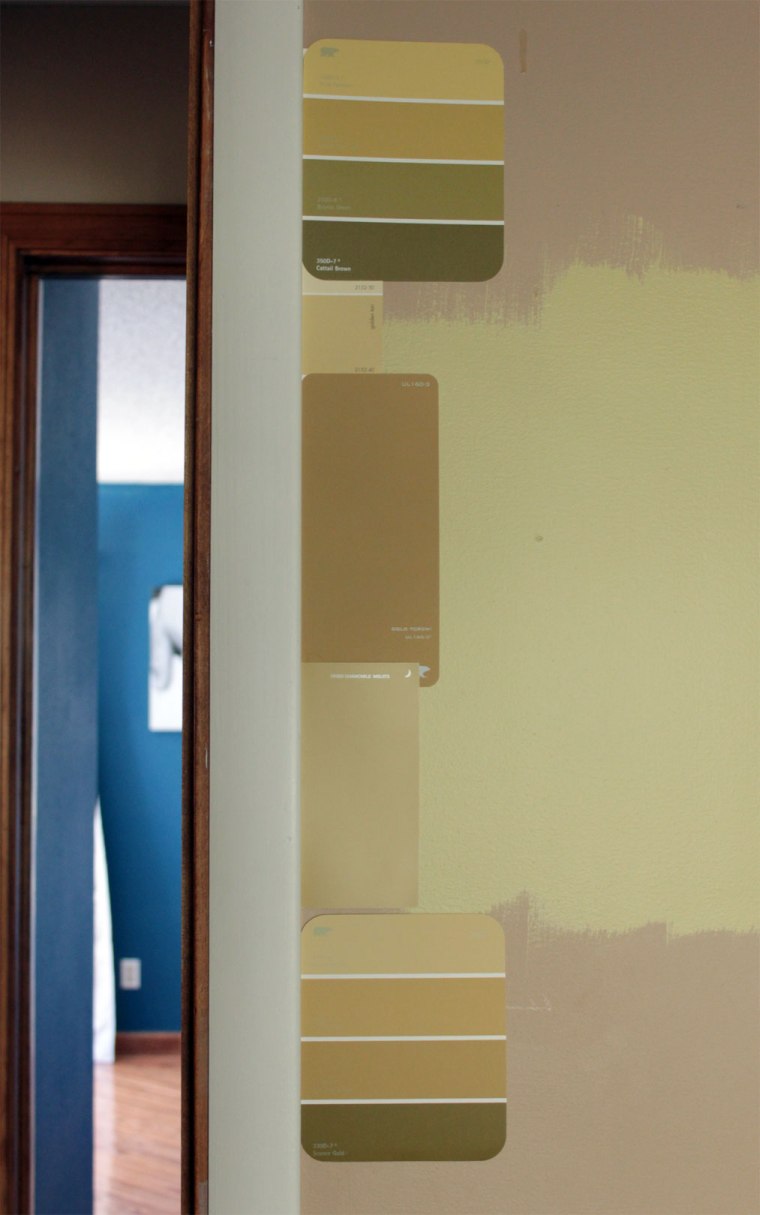
Ben’s happy about hunting season.  I’m excited for painting season.  Okay, it’s really not a season, more of an itch I need to scratch.  A desire to make this house feel more like us, and less like the previous owner.  And what bigger, cheap, and quick change than paint?  So I’ve hoarded samples and painted swatches on the walls.  For the guest bedroom, I’m set on yellow, though it is proving to be difficult.

On the far left is Anjou Pear by Ben Moore (which I got for the boys’ room, but tested in here, too), middle is Willow’s Gold from Dutch Boy and the right is a 50% tint of Willow’s Gold.  During the day, I loved the middle color.  Sadly, the CFL bulbs turned the pretty greeny-gold to key lime at night.  More swatches, this time in the tan-ish gold department.  I think I’ve pinned down a color from the chips shown.

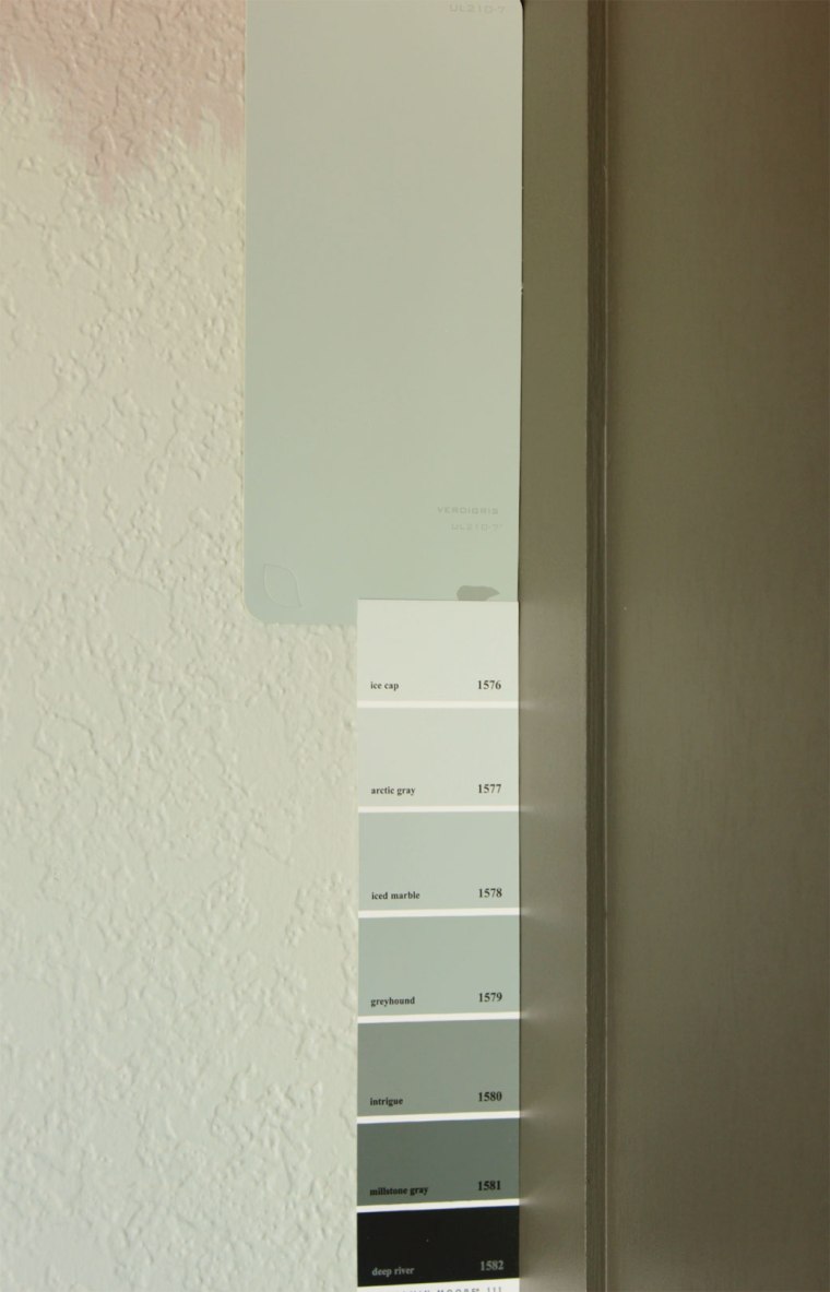
Finding a pale, muted green-blue-gray for the north facing family room is really hard, too.  Now I’m considering painting the living room a blue-green and use Wood Smoke in the family room.  The blue colors seem to look better in brighter, sunnier spaces.

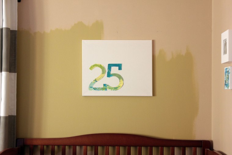
I have made some paint selecting progress.  Anjou Pear by Ben Moore for the boys’ bedroom.  During the day, it reads as a warm green, but at night it takes on a more muddy green.  Against the tan it looks a little crazy, but the striped curtains tone it down.

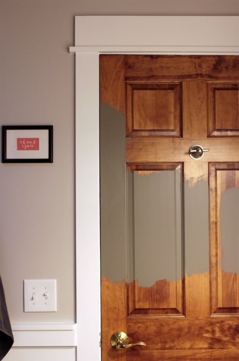
And I’m gearing up to paint all the doors Squirrel by Behr, color matched to Glidden.  Actually, I’ve already started.

The dark color should hide dirt and grime, and the muddy gray modernizes the shiny brass door handles.  We’re happy with the quality of the six panel doors, but some of the grain makes the doors look a little like plastic.

Sun rises and sets are stunning this time of year, too.  Here is a shot from last week, with a perfect crescent moon.

Hope all our fellow U.S. residents have a safe and happy Thanksgiving!

Painting on Jersey Shore

Um, not the show Jersey Shore that I refuse to watch for fear I’d have three brain cells left.  Or even the geographic location of the Jersey shore.  I’m talking about a little painting project the boys and I did yesterday that vaguely resembles modern sports jerseys.  Back when we still lived at our first house, I made magazine ad artwork for the boys’ bedroom.

Great colors, fun animals, and free, in a word, love.  But neither of my boys are babies anymore.  Vincent is Rubik’s cube loving, movie quoting, bike riding five-year old.  And Everett’s a jump on/off/to everything, dirt digging, Matchbox car racing two and a half-year old.  The baby-ish artwork didn’t match their personalities anymore.  Five cluttered looking frames weren’t working for me either, so I set out to make free, personalized art involving the kids.

I found two still in the package 16 by 20 inch canvases in the basement, begging to be used.  Then I opened Photoshop and typed 21 and 25, Vincent and Everett’s birth dates and changed the fonts until I found one I liked best.  Museo Slab, if you’re wondering.  To make the art look less like a jersey, I decided to overlap the number slightly for a more artistic look.

I considered tracing the numbers, taping off everything and letting the boys paint, but that seemed like too much work.  Instead, I flipped the numbers to make a mirror image, printed on card stock, and cut them out.

The boys each painted their number using acrylic paints.

Once the paint dried, I flipped the numbers over and stuck plenty of rolled tape on.  In another attempt to make these look less like sports attire, I placed the numbers in the bottom left corner, rather than the center.

V stuck with greens and yellow for his.

Then went color crazy by adding various blues to the mix on E’s number.

I like that these are personal and were as easy as printing, cutting, and painting numbers.  And we can just as easily pull the numbers off and paint something on the canvases if we get bored.

I might use stronger tape though because the thick card stock is kind of warped from the paint.

If not for my free goal, I would have preferred square canvases, perhaps 24 by 24 inches.

Like I said, we can easily change this down the line.  For now, I’m really happy with the white space versus painted design.  And fonts/numbers are always good in my book.

Now I’m curious, what do you have as art over beds?  Whether kids, yours, or a guest bed.  Do you prefer single larger pieces?  Or a grouping of smaller ones?  Perhaps, you’re a font/number geek?  Let’s unite!

P.S.  In response to our recent survey (which you can still fill out here), several commenters suggested bigger, brighter pictures.  For larger pictures, click on the photo.  Are these brighter/bright enough/too bright?