In some ways, it’s hard to believe, but today marks four years since getting the keys to this house. Often, I have to think hard to remember just how (bad some) things were when we moved in. Others are fresh in my memory since we’ve only recently made changes. Either way, it’s always fun and satisfying to take a walk down memory lane, if for no other reason than to appreciate how far we’ve come.
Four years feels fast, considering we’ve tackled every room (or are in the process of reworking, as is the case of the basement). Four years also feels slow, chugging away, waiting for the right time to start projects, or finishing another before moving to the next. Home is a constant creation, finding each perfect piece and putting it into place. Overall, we’re both so happy with the progress and love living here, enjoying the views, and are excited to continue our progress.
Okay, enough of the sapiness, on with the then and now tour, starting in the entry. In the past, I’ve done these tours in one long post, but this one is especially picture heavy so I’m splitting it into two parts; today you’ll see the living areas.
Before felt dark, dated, and dingy. Those peach walls always looked dirty, the dark wood door and side lights overwhelmed, and an overly intricate Tiffany style light felt stuffy and too traditional. And the railings, oh the sheer amount of orange toned oak.

Swapping the standard height door for a double wide, 8 foot tall one (taken from the dining room) and shorter, transom style window above dramatically brighten and update this small space.

To add interest to the large wall (and cover up the heavy knock down texture), we added tongue and groove planks, painted white, to lighten up and add the good kind of texture. The stained beige marble floors days are numbered, to be replaced with Montauk black slate.

Replacing the traditional spindle railing for a sleek horizontal design made a huge difference. A modern, multi arm light juxtaposes with the more rustic elements, like the horns.

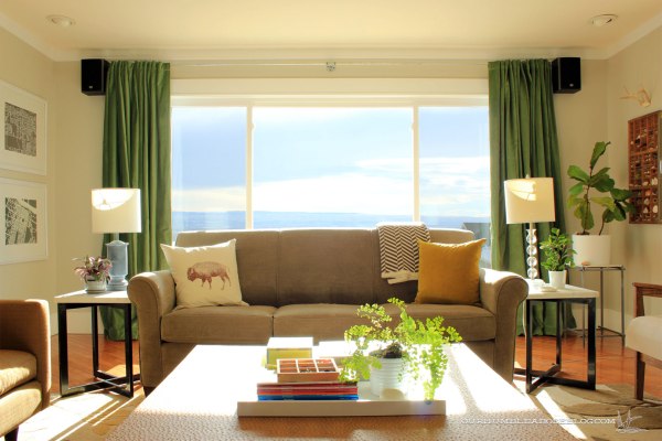
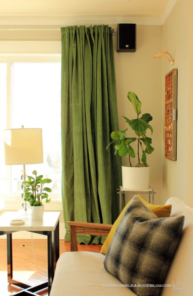
Once at the top of the stairs, the living and dining rooms are to the left. Before, the traditional windows with grids and the eight foot tall door were dark and broke up the beautiful views out front.

New windows, light trim and paint, and bold doses of green add vibrancy to the south-facing rooms. Ignore the sofa backing the window, it’s here until the basement theater room is ready for it.

Those ornate fixtures, both hanging and the pair of sconces were poorly placed, neither centered on anything. With the open flow of rooms, the arch separating the entry and living room didn’t make sense.

Knowing we planned to use this room daily, for tv watching, relaxing, and toy playing, we built a large entertainment center with drawers for ample storage. Nearly all the boys’ toys are stored in those nine drawers, so it certainly has served its purpose.

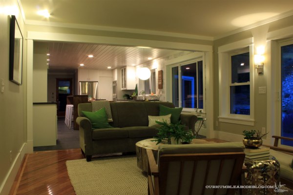
Dual mismatched sofas, one leather, the other a slim wood and linen design, face one another, offering plenty of seating. This arrangement still allows a full view of the mountain and city scene out the windows.

Positioning the leather sofa parallel to the dining room offers a bit of separation of the open floor plan without a formal divide.

Ugh, every time I see this light I remember how many times I smashed my head on that dang thing. Why the previous owner placed an eight foot tall door in a room with eight foot ceilings, I’ll never know. Not only does it look awkward, it didn’t allow for a proper header and wasn’t stable. The bay window sagged over time, making it non functional.

After pulling the door out and installing it in the entry, we swapped the arrangement of window and door, extending the deck over to make a more usable arrangement both inside and out. A large mission style dining set, centered on the window and door, fills the space.

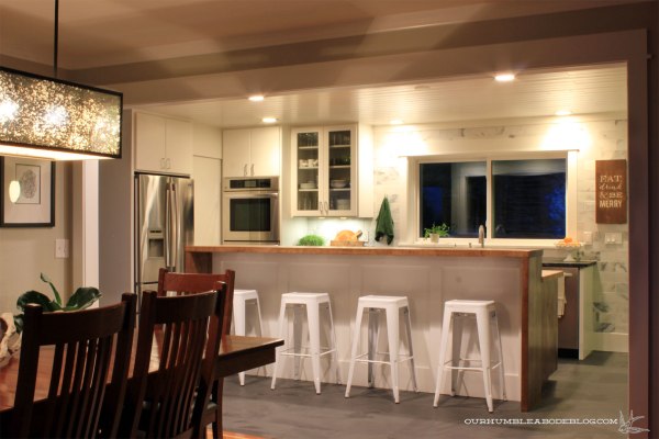
To further open the floor plan, we knocked out the majority of the wall between the dining and kitchen. The twelve-foot wide door makes entertaining and daily living even more enjoyable.

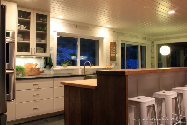
Opening the wall also floods the north facing kitchen with natural light. Dark oak cabinets, 80’s country blue wall paper, and an over sized flourescent light didn’t help this kitchen. However, it was a large, open size.

Swapping the dated, broken cabinets for sleek white DIY ones really changes the look and function. A full wall of white Carrara marble brings in natural tones and subtle texture variation. Dark slate floors are used throughout the house, for continuity and, well, we love the material.

Two more bay windows that couldn’t open properly, yet another gaudy light, and heavy knock down texture on the ceilings were primary offenders.

For the most part, the new layout is very similar to the original. All drawer lowers keep everything organized and completely accessible. As much as I adore white kitchens, I like the balance of warm wood tones, so we created a custom walnut island. As with the slate floors, we’ve used white tongue and groove boards in designs around the house. The ceiling here was textured, cracked, and had several holes from lighting. Rather than painstakingly skim coating the ceiling and hoping it didn’t crack again, we put up our favorite material to hide the flaws.

A wall of floor to ceiling cabinets made a main walkway even smaller, and made a not so fun Ring Around the Rosie game to get pantry staples out.

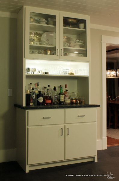
After opening up the wall, we still had about seven feet of space off to the side. For added function, we built a bar/hutch in this space.

Vases, extra dishes, and overstock liquor are stored below, leaving the upper for pretty dishes and a fully stocked bar.

At the back of the house is our family room, previously seen with a dirt covered moss rock fireplace, an unused nook, and broken windows. For reference, the arched doorway to the right leads straight down the stairs.

Covering the fireplace, adding a wood burning insert, and shelves in the nook, are all changes we love. We also replaced the old, broken windows with energy-efficient functioning ones. It’s nice to be able to open windows in here to get some air movement.

Another open layout, the family room backs up to the kitchen and breakfast nook. Yet another arched divider that didn’t fit the style of the house.

Landing on the most useful, functional furniture arrangement in this room surrounded by walkways wasn’t easy. After trial and error, testing, and rearranging, this layout has proven to work. Sofa backing the room, large stump coffee table centered, with two modern chairs flanking the fireplace still leaves walk space.


Bedrooms and bathrooms will come tomorrow, so stay tuned to see those changes. To see the progression of these spaces over the years, check out the first year, second, and last year.
It hasn’t been an overnight transformation, but I’d say each room is at least 90% finished. Most of the changes I want to make are simply waiting to find the right furniture or accessory to finish it off. A larger rug for the living room. Perhaps a different set of chairs around the breakfast table. A bench at the foot of our bed, but nothing major. Nope, the main level is feeling like home. The basement now, that’s a different story. Don’t even get me started on the pool house situation-haha.